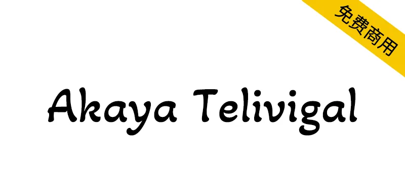
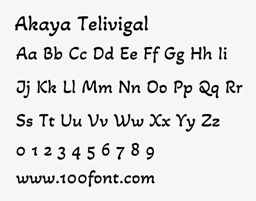
Akaya是一種單一粗細的實驗性字體,使用卡納達語、泰盧固語和拉丁文字。Akaya Telivigala和Akaya Kanadaka是兩個獨立的字體文件,它們共享一個共同的拉丁語。
關於Akaya:泰盧固語和卡納達語的文字可以追溯到高度風格化的卡丹巴文字。在接下來的幾個世紀裡,這些文字受到歷代王朝的庇護,他們多次重新解釋這些文字。這些解釋在本質上越來越務實,在很大程度上消除了結構上的複雜性。
這種簡化被早期的基督教傳教士更進一步,他們為這些劇本製作了第一個主角類型。然而,當他們這樣做的時候,他們引入了一種受銅版啟發的筆劃調製方法來調製這些字符,在那之前,這些字符在本質上基本上是單線的。這些字體的筆劃調製是沿著橫軸的。這裡的字母形狀是幾何的和構造的。傳教士的這些早期實驗仍然是最廣泛接受的風格,在文本設置中效果良好。
當人們環顧今天在書名、塗鴉或宣傳告示上發現的手寫泰盧固語或卡納達語景觀時,一種反覆出現的書法風格是顯而易見的。這似乎與刻板、正式的文本風格截然不同。這裡的字母形狀更流暢,比例也更大方。筆劃調製和對角線重音呼應了拉丁書法,適用於卡納達語和泰盧固語。Akaya是基於這種生動的手寫風格。
Akaya的字母形狀試驗了反向導管,每個字符的書寫方向都是反向的,以增加流動性。阿卡亞拉丁語也採用了相同的原理和對比角度,這取決於字母的結構。這形成了其特徵形狀的基礎。
Akaya is a single weight experimental display typeface in Kannada, Telugu and Latin scripts. Akaya Telivigala and Akaya Kanadaka are made as two separate font files which share a common Latin.
About Akaya
Telugu and Kannada scripts trace their origins to the highly stylised Kadamba script. Over the following centuries, these scripts were patronised by successive dynasties who reinterpreted this script several times. These interpretations were increasingly pragmatic in nature, stripping off structural complications to a great degree.
This simplification was taken a step further by the early Christian missionaries who made the first lead types for these scripts. However, when they did this, they introduced a copperplate inspired stroke modulation to these characters which were largely monolinear in nature till then. The stroke modulations in these founts followed the horizontal axis. The letter shapes here were geometric and constructed. These early experiments by the missionaries remains the most widely accepted style and works well for text settings.
When one looks around the hand-written Telugu or Kannada landscape today, found on book titles, graffiti or propaganda notices, a recurring calligraphic style is evident. This appears quite distinct from the rigid, formal text styles. The letters’ shapes here are more fluid and proportions more generous. The stroke modulations and the diagonal stress echo Latin calligraphy and work well for both Kannada and Telugu scripts. Akaya is based on this lively hand-written style.
The letter shapes for Akaya experimented with reverse ductus, where each character is written with its stroke direction reversed to add fluidity. The same principle and contrast angle is applied in Akaya Latin, depending on the structure of the letter. This is forms the basis for its characteristic shapes.
本字體以SIL Open Font License 1.1(SIL 開源字型授權版本1.1,簡稱SIL OFL 或OFL)授權協議發佈,這個授權的自由度非常高:
✔ 這款字體無論是個人還是企業都可以自由免費商用,無需知會或者標明原作者。
✔ 這款字體可以自由傳播、分享,或者將字體安裝於系統、軟件或APP中也是允許的,可以與任何軟件捆綁再分發以及/或一併銷售。
✔ 這款字體可以自由修改、改造,但修改或改造後的字體也必須同樣以SIL Open Font License 1.1授權公開。
✘ 這款字體禁止用於違法行為,如因使用這款字體產生糾紛或法律訴訟,作者不承擔任何責任。
✘ 根據SIL Open Font License 1.1的規定,禁止單獨出售字體文件(OTF/TTF文件)的行為。
關於SIL Open Font License 1.1授權協議的內容、免責事項等詳細細節,請查看詳細的License授權文件的內容。
字體來源出處1:https://github.com/vaishnavimurthy/Akaya-Telivigala
字體來源出處2:https://fonts.google.com/specimen/Akaya+Telivigala (需要科學上網才能打開)
